How Color Grading Impacts Retouching Results — learn how professionals create flawless results with expert photo retouching.
Grow Your Business with Proven Digital Strategies
Get expert help in SEO, paid ads, and automation. Let’s take your growth to the next level — tailored to the U.S. market.
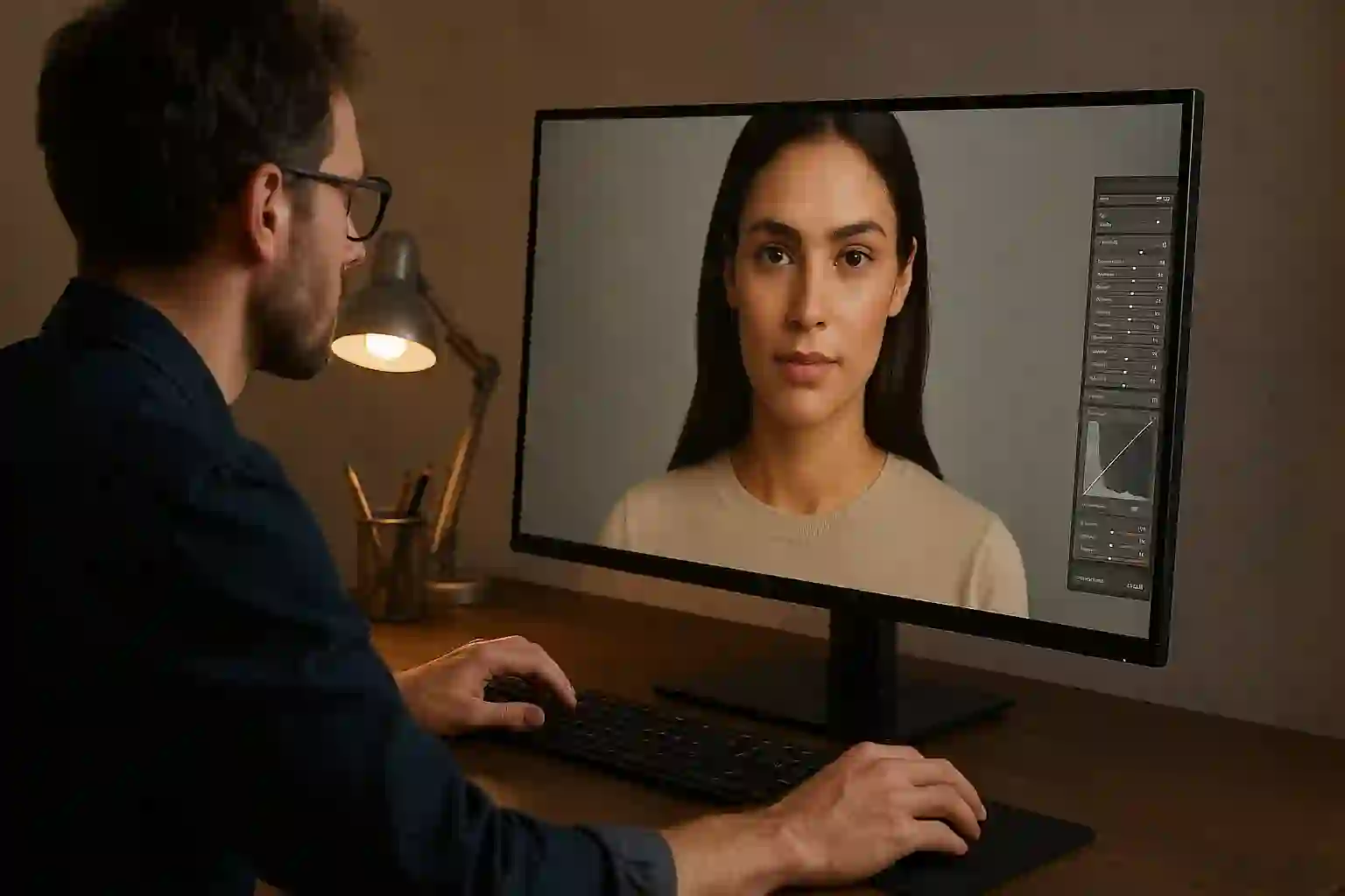
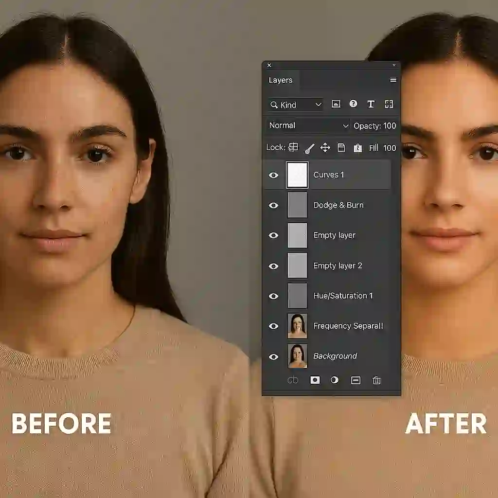
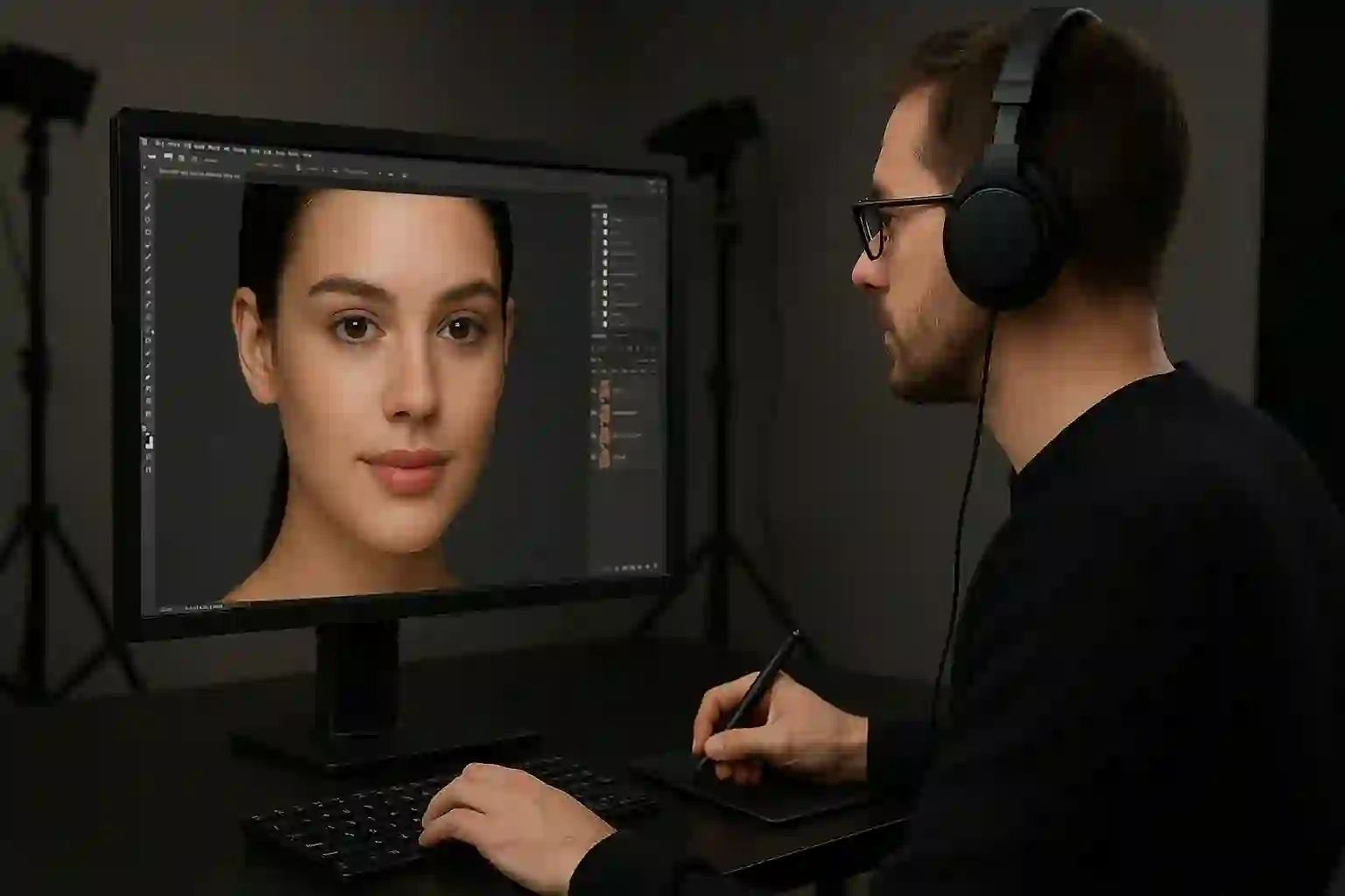
When most people think of retouching, they imagine skin clean-up, stray hairs, and lighting fixes. But there’s one step that can completely shift the mood, tone, and effectiveness of an image — color grading. Done well, it enhances the result. Done poorly, it can undo hours of expert retouching.
What Is Color Grading in Retouching?
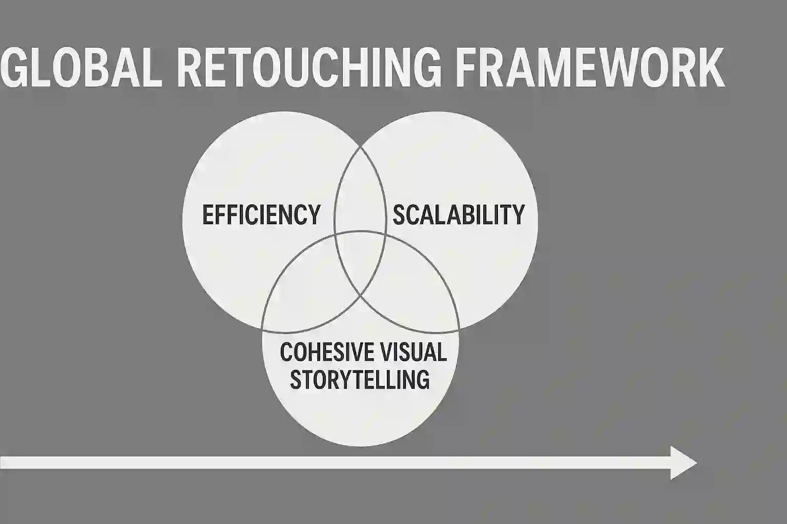
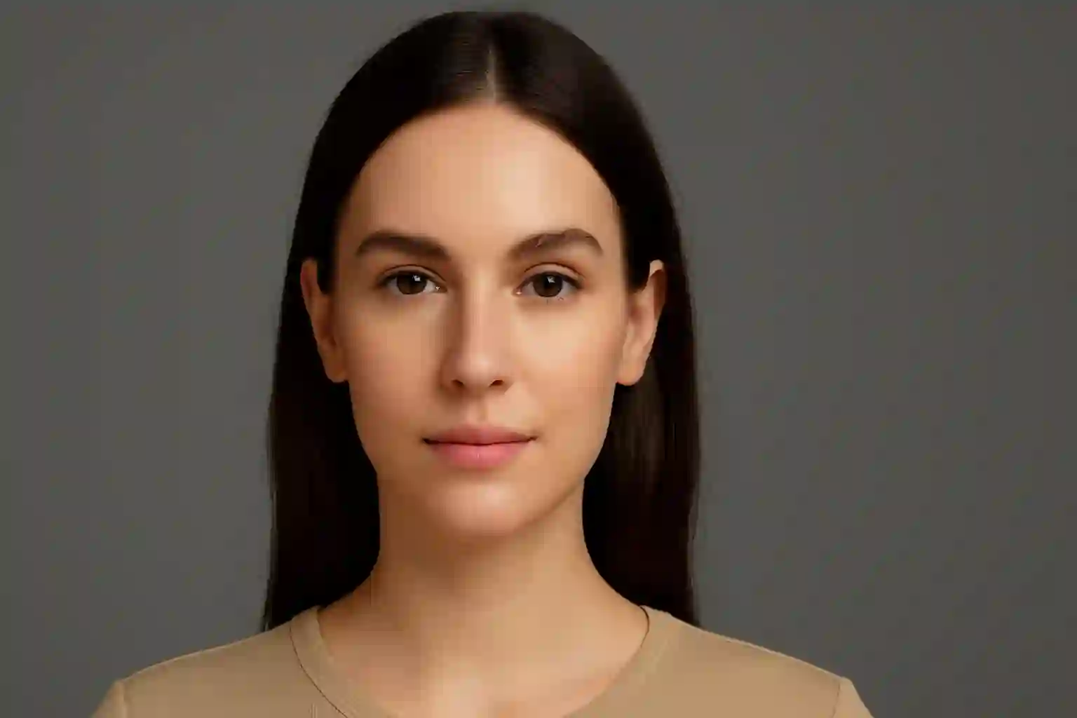
Color grading is the process of manipulating tones, contrast, hue, and saturation to guide mood and visual storytelling. In high-end retouching, it's often the final step — and one of the most impactful.
While basic color correction ensures images are technically accurate, color grading is about creative intent. It answers questions like:
- Should this image feel warm and romantic, or cold and editorial?
- Do we want skin tones to lean golden or neutral?
- Should the product stand out, or feel blended into the palette?
Why Color Grading Impacts Retouching Outcomes
Color grading can enhance — or completely sabotage — retouching if not done thoughtfully. That’s because it interacts directly with how light, texture, and detail are perceived.
Here’s how color grading directly affects the outcome of a retouched image:
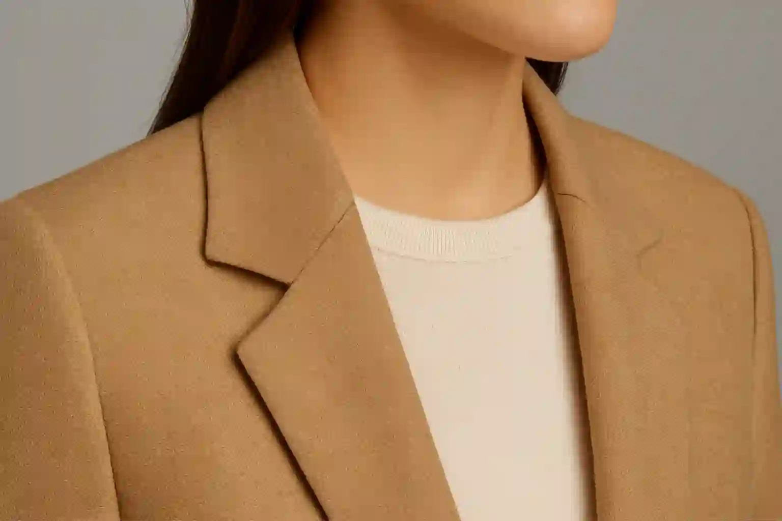
- Skin tones: A heavy cyan or green cast can make even perfectly retouched skin look dull or sickly
- Texture: Pushed contrast or clarity can flatten subtle edits and destroy softness
- Highlights and shadows: Shifting tones can add or reduce drama and depth in facial structure and garments
- Product realism: Incorrect grading may distort the color of makeup, clothing, or materials — hurting conversions
Editorial vs. Commercial Grading Styles
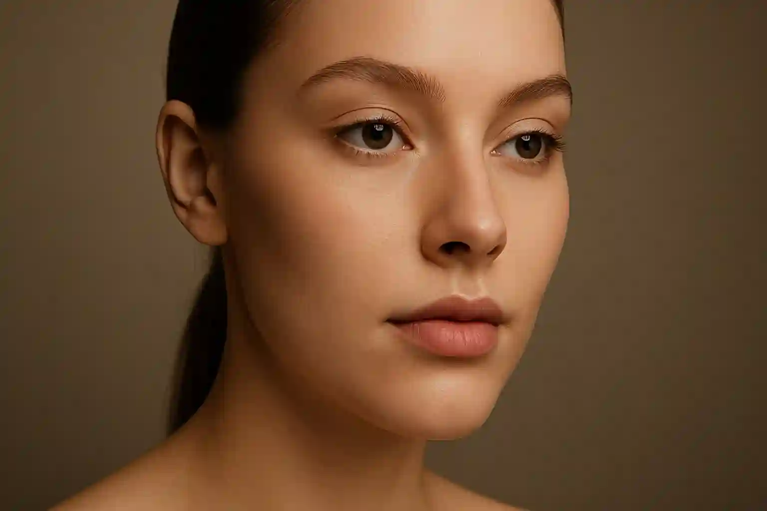
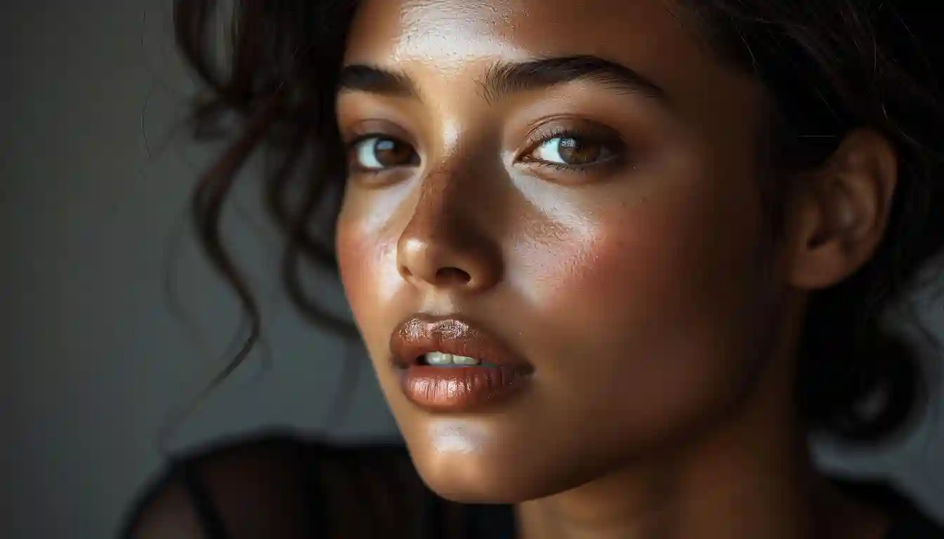
In editorial, color grading often leans stylized — desaturated shadows, vintage tones, or bold highlights. In commercial beauty, the focus is on accuracy: true skin tones, color-corrected products, and polished realism.
Understanding this distinction is critical. Editors and creative directors expect color work to match the campaign’s visual language — and working with a team that understands the context makes a difference.
Our Approach to Color in Retouching
At Retouch Club, color grading is never an afterthought. We treat color as a core part of the visual strategy. Our process includes:
- Collaborating with photographers and art directors on visual references
- Preserving natural tones while enhancing atmosphere
- Custom grading for each project type: editorial, beauty, product, fashion
- File delivery in formats optimized for both print and digital (CMYK & RGB)
Real Campaign Results
Our color work has helped brands shift from “nice images” to “emotionally resonant visuals” that drive stronger engagement, feature in publications, and boost online conversion rates.
Want Your Images to Feel as Good as They Look?
If your visuals look technically correct but emotionally flat — the missing piece is likely color grading. Explore our full retouching workflow and see how light, color, and tone work together to create impact.
Learn More About Image Strategy
- Discover our high-end services for full campaign and editorial work
- See what color styles are trending in fashion and product photography
- Read how color impacts brand identity and consumer behavior
Grow Your Business with Proven Digital Strategies
Get expert help in SEO, paid ads, and automation. Let’s take your growth to the next level — tailored to the U.S. market.